
Brief
To redesign the checkout process for an e-commerce website (www.shopperstop.com) and improve the user experience by creating a more streamlined and user-friendly checkout process.

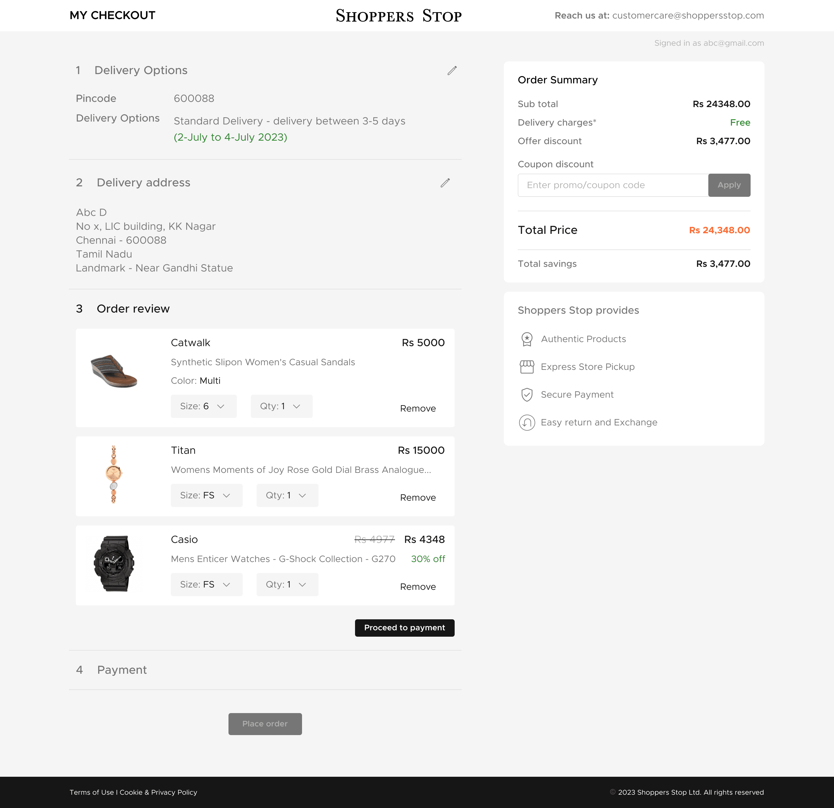
The user finds no option to select the required items in cart for checkout
Order summary is for the whole items
The user is forced to checkout all the items in the cart

The delivery option is available in cart page, the user in checkout page, needs to come back to cart page to edit the option
Three options are open for the user to select, only after selecting an option, the user will get to know weather the option is applicable for delivery

Here, after selecting express delivery option, the user gets to know that the option is unavailable. So, the user gets frustrated and needs to choose an another option
The user wont able to know directly the delivery options that are available for the pincode typed

1
The user might get confused with the design of displaying the steps.
The steps are not aligned with the respective field, the user might not understand at first sight.
2
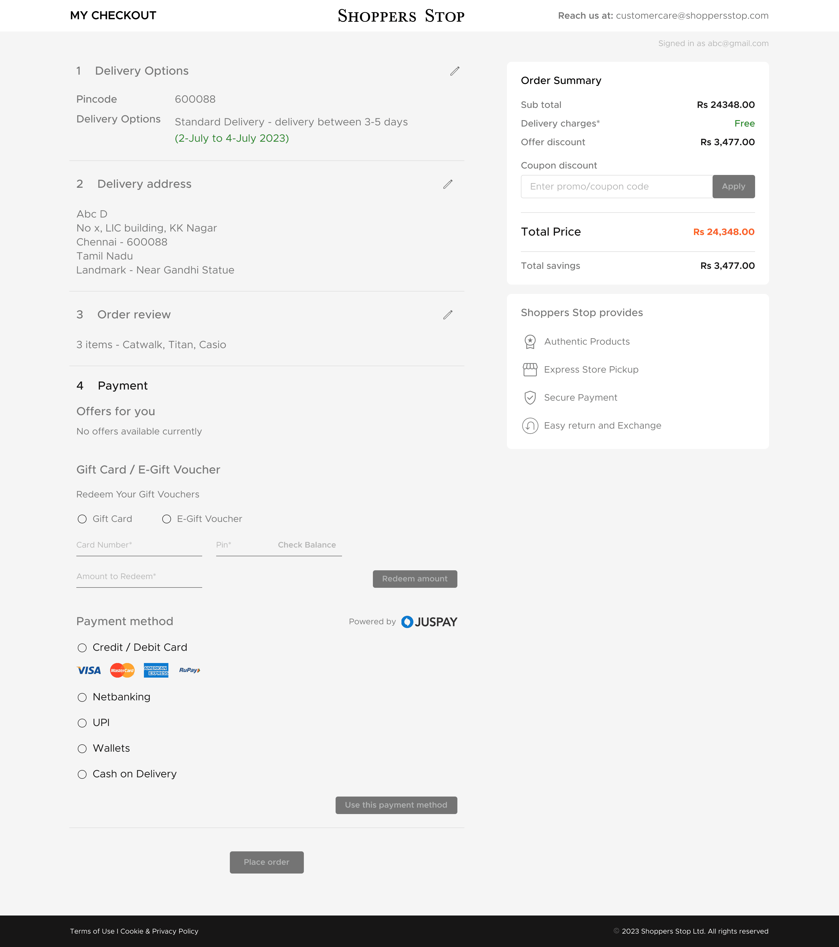
The payment options are hidden. When the user clicks, it takes time to load and makes the user to wait.
3
When the user needs to edit items, it leads to cart page and then only the user can able to edit. This makes the user to wait and it consumes more time. This might lead the user to leave the checkout process.
4
In the checkout page, the user needs to scroll down to see the order summary.
More important details are show in bottom and comparatively less important, like apply coupon is displayed on the top.
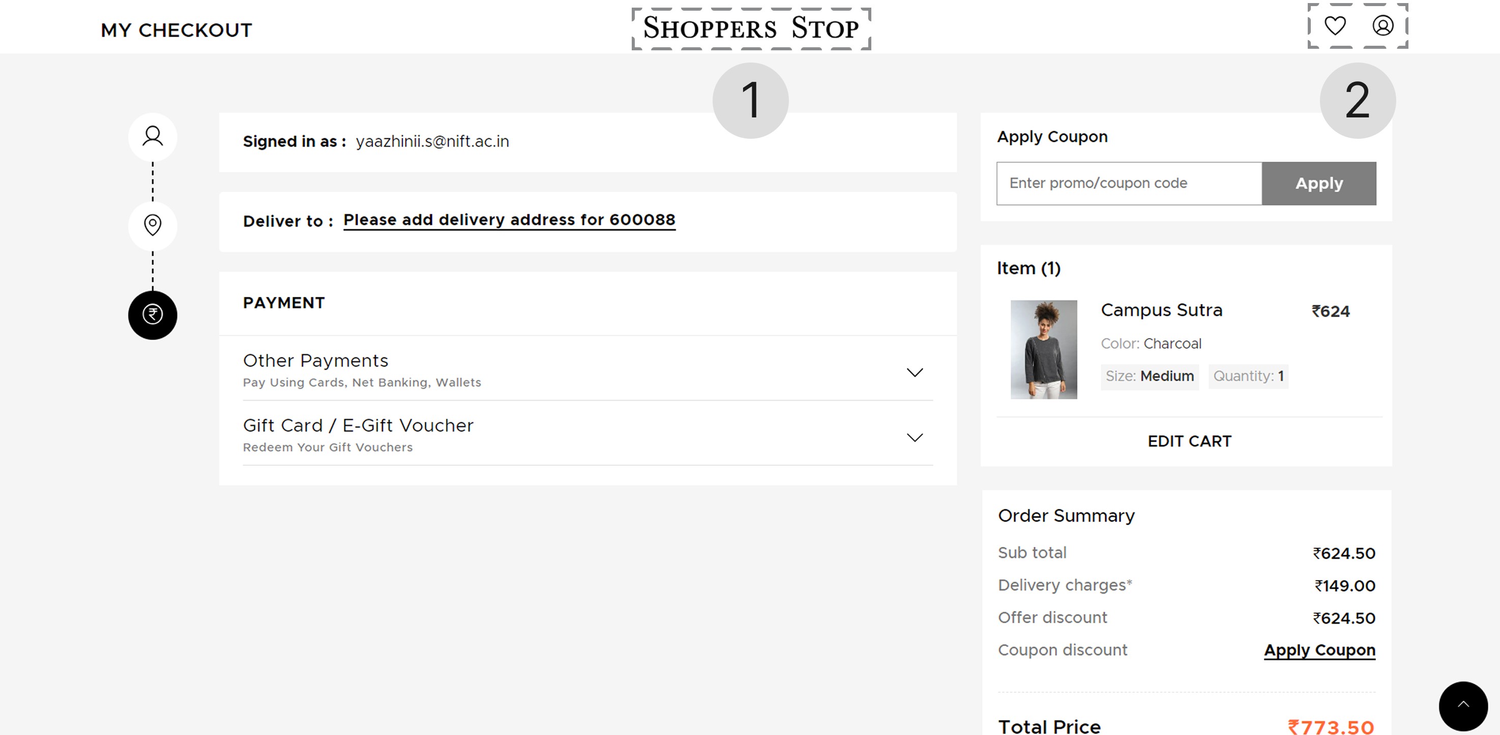
1
When clicked on the logo, it directly goes to the home page, this makes the user to leave the checkout page
2
In the checkout page, the favourites and my account CTAs distracts the user from the checkout process (the user might get deviated to the other page)

The footer in the checkout page deviates the user from buying the product. This increases the cart abandonment rate
Style guide
Typography
The brand’s typography (from their website) has been followed in the re-design